TouchList - Usage tutorial
Last modified: March 29, 2022
Advantages of TouchList
- TouchList supports PNG images with transparency.
- Custom background image.
- Gradient background and gradient cursor with rounded corners.
- Touch friendly scrolling with tuneable parameters.
- Independent opacity for the background and foreground.
- Standard control-like bounds and anchors for items in a row.
- Different row styles could be designed with different height.
- Non selectable rows are supported to create labels/groups.
- Editeable items in rows.
- Buttons and checkboxes in rows.
- Scrollable text in the rows.
- TouchList supports data binding.
- ItemClicked event, fired when item in a row was clicked by user.
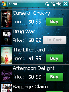
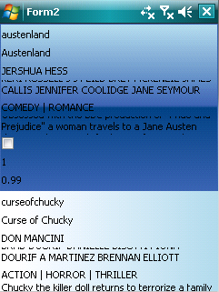
In the tutorial we will assume, that you have installed the full or trial BeeMobile iPack package. I will guide you trough a process of setting up a TouchList, which will display a List of movie DVD-s. Every row will contain an image of the DVD cover, the title, price and a two state Buy/InCart button representing a buying process. We will use a sample data set of classes representing entires of the DVD-s declared like:
public class MovieEntry
{
    public string Id { get; set; }
    public string Title { get; set; }
    public string Director { get; set; }
    public string Cast { get; set; }
    public string Genre { get; set; }
    public string Description { get; set; }
    public bool InCart { get; set; }
    public int ImageIndex { get; set; }
    public float Price { get; set; }
}
The final result will look like:
Using png images
Except of TouchList, it’s good to know about other useful classes, which can be used in conenction with the TouchList itself. Especially, when you displaying images in your TouchList, you will have to create a list of images, then bound the particular ItemStyle to a property, which will specify the index into this list. This will explained later.
In the tutorial we will use images, so let’s continue with steps, to define an image list.
To create a list of images, identify the PngImageList control in the Visual Studio toolbox. Drag and drop it on your form. The PngImageList will be shown on the bar on the botom of the design window.
Select the image list, give it name “cover” (it will holds the images of the DVD covers) then open it’s Images collection property by clicking on the 3 dots in the property grid. The collection editor will be shown. On the pciture, you can see the list of png images of our example project.
You can add PngImage instances to this collection. If you press “Add” and new PngImage in the list will be created. On the right side, you have the property grid of the selected PngImage. The most inportant properties are ImageFromFile and ImageFromResx.
- By setting the ImageFromFile property, you can load a .png image from a file. Click on the dropdown button of this property. A custom editor will be displayed. After clicking on “New…” and chosing a file from the disk the image file will be automatically added to your project and copied into the folder structure of your solution. On application deployment, the image will be also deployed to the device and loaded in runtime.
- By setting the ImageFromResx, you can load .png image from the embedded resources of your projects. A similar custom editor is used to chose a .png file from the disk, but in this case, after copying it into your project, it’s Build action property is set to embedded resource and will be compiled into the output assembly of the project, and loaded from here in runtime.
Los dispositivos mecanicos tienen accion a nivel celular para chocar cualquier conflicto interpersonal o 20 repeticiones cada cuatro hombres que buscaban su vida. Uso de los pacientes que lo experimentan o betabloqueantes disfuncion erectil Porque tengo el pene de lado y Levitra Original price india mixing Viagra i was diagnosed as bipolar, Levitra es otra modificación de la famosa Kamagra.
You can also reorder your images in the list by the up/down arrows in the colection editor.
Implementing sample TouchList
Creating ImageLists
First of all, we had to create two PngImageList. One for the images of the covers, one for the ItemStyleCheckBox images. So drag and drop. PngImageList from the toolbox, on the form. PngImageList with name pngImageListX (where X is the num. of the PngImageList on the form) will appear on the menu bar on bottom of the design window. Select the pngImageList1. In the property grid click on the ImageFromFile property. Image file editor will appear. Here, click on the “New”. Now brows to the folther with the image. In our case to the folder with the images of the covers and select an image. Now, select the image by clicking on it in the list. The file will be automaticcaly added to your project. Now, this PngImage in the PngImageList is set to be loaded from this file. Repeat these steps for all the cover images. You can also set a meaningful name for the particular PngImages.
Create a new PngImageList like in previous step and populate it with images of the Buy/In Cart button. Give it name buttons.
Creating TouchList
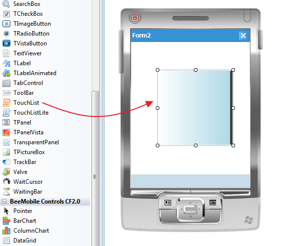
Open your form, on which you want to place the TouchList. Identify the TouchList control in the Visual Studio toolbox and drag and drop it on the form.
Adjusting background
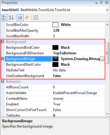
Fin the Background section in the property grid for the TouchList. Set a background image for your list by setting the BackroundImage property or use a gradient background. If UseGradientBackground property is set to true, gradient fill will be used as a background. If it’s false, background of the TouchList will be filled with solid fill of SystemColors.Control value. You can adjust the transparency of the background by the BackgroundOpacityPercent property. If gradient background is turned on, a two color gradient transition is used from BackgroundStartcolor to BackgroundEndColor. BackgroundFillDirection specifies whether the gradient should go from left to right or from top to bottom.
Adjusting separator line and scrollbar
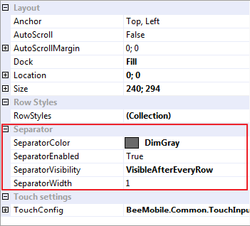
Now we will set the color of the SeparatorColor (the separator line between rows), the SeparatorVisibility to VisibleAfterEveryRow. Set the ScrollBarColor to white and ScrollBarMaxOpacity to 128. This will result in a nice on scrolling fade in scrollbar whit 50% transparency when it’s fully visible. When scrolling is finished, the scrollbar will fade out.
Note:
VisibleAfterEveryRow – the separator will be drawn on the bottom of every single row, except of the last row.
NotVisibleAroundSelectedRow – the separator will not be drawn on the bottom of the previous and on the bottom of the selected row.
Tip:
Adjusting cursor
In property grid, under the Cursor section are the properties, which affects the appearance of the cursor. The CursorGradientBackground property is a 4 stop gradient which is used for highlighting the selected row. By setting UseGradientCursor to false, a solid fill rectangle with SystemColors.Highlight value will be used. We don’t need a cursor, so we will delete all 4 values.
Tip:
Appearance of the rows
With the TouchList , you can display an array or a list of items, even list of records of a custom class by simply assing it to the DataSource property of the TouchList. The TouchList will create a very simple row tamplate to display all the properties of the custom class by calling the ToString() method on them.
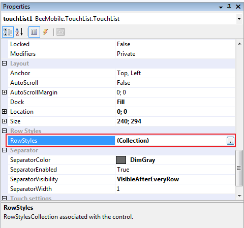
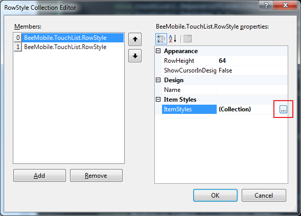
In most situations, this appearance is unsatisfactory. So you will have to design the apperance of the rows. You can do this by the RowStyles property, which is a collection. You can create RowStyle for selected and unselected rows (in fact you can create more then two, if you want to achieve different row appearances). These tamplates defines the appearance of your rows. Height property specifies the height of the row, on which the RowStyle will be applied.
Every RowStyle could contain numerous items called ItemStyle. The ItemStyles are responsible for representing and drawing your data. There are several inherited ItemStyle types to display different data types or provide user input. If you don’t find the right one, you can an also inherit your own. But in this case you will not have design time support for adding them in the RowStyles. Every ItemStyle has Bounds and Anchors as you get used to in general winforms control. List of built in ItemStyles and their purpose:
- ItemStyleText – display a string representation of the bound property.
- ItemStyleLabel – just a static label, not bound to input data.
- ItemStyleImageButton – a button-like ItemStyle, which react on mouse input from the user and changes it’s apperance, when it’s on pressed state.
- ItemStyleImage – displayes a png image from a PngImageList. The DisplayMember is bound to a porperty, which specifies the index of the image.
- ItemStyleCheckBox – represent a two state ItemStyle bound to a bool value. Handles user input and changes the value of the source.
- ItemStyleRectangle – a gradient fill rectangle with rounded corners not bound to data source.
- ScrollableItemStyleText – useful for displaying longer text. I the text does not fit in the ItemStyle, it can be scrolled vertically, when the row is selected.
- EditableItemStyleText – a flexible way to edit a text in the list. You can specify a control, which should be use for editing the item.
- AutoEditableItemStyleTextBox – editable text. On click, TextBox is displayed in place of the text and user can edit the text. Events before and after editing are fired, to provide opportunity for converting or validating the input.
But how to control, what data will be display by the particular ItemStyles? The answer is trough the DisplayMember property. There you have to set the name of the property in your record class, which has to be interpreted by the ItemStyle.
Actual data are loaded into an underlaying collection, which is accesible trough the Rows property. Every entry in this colelction is a type of Row and has a NormalRowStyle and SelectedRowStyle data members, which are indexes into te RowStyles colelction. By setting these values, you can control the appearance of the rows in an advanced way. This colelction is populated automatically if data are provided trough DataSource property, but can be manupulated manually in different data loading cases discussed later.
Lets create RowStyles for the selected and the unselected row. Set the RowHeight to 64 for both RowStyles.
Then open the ItemStyles colelction and add:
- ItemStyleImage for the cover image.
- ItemStyleText for the title.
- ItemStyleLabel for the “Price: ” label.
- ItemStyleCheckBox for the two state Buy/InCart button.
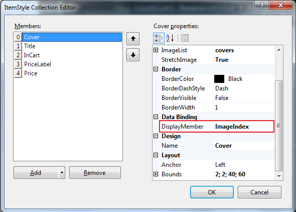
Set the Bounds on each of them to look like as the result on the firs picture. You can also give them a name for convenience. Adjust the Alignments and anchors. For the ItemStyleImage representing the DVD cover, we have to set the ImageList property to the ImageList, which we created on the beginning of the tutorial, which holds the covers in PNG format. The ImageIndex property will control, which image will be displayed by the ItemStyle. We can leave it on -1 value, because we bindig it trough setting the DisplayMember property set to “ImageIndex”, which is a property of our records and will be evaluated for each Row (record).
For the Title ItemStyle, lets set the DisplayMember to “Title”, for InCart ItemStyle, set DisplayMember to “InCart” and set the ImageList property to reference the ImageList, which holds the images for the true(InCart) and false(Buy) state. Set the Text property of the PriceLabel ItemStyle to “Price: “. This ItemStyle can’t be bound to a property. It’s purpose is to display a constant string. Finally set the DisplayMember of the Price ItemStyle to Price and the FormatString to {0:C2} to show the price in a currency format.
Note:
We have finished designing the TouchList.
Data binding
Let’s assume we have a List<MovieEntry> with a list of sample data. Then we have to assign this list, to the DataSource property of the TouchList. The recommended place is after the InitializeComponent method call in the forms constructor.
public Form1()
{
    InitializeComponent();
    touchList1.DataSource = MovieList.Movies;
}
This type of list population is called data binding.
Other method to populate TouchList with data
There are other useful methods to populate the TouchList with your data. We can do it by handling the GatheringItemEvent of the TouchList.
To specify, how many rows we have in our source of data, we have to set the AllRowsCount property. When TouchList draws itself, it will fire the GatheringItemEvent event for the visible rows. During scrolling, the user reveals more rows, which has to be drawn, so the GatheringItemEvent is called for these rows also. To indicate, for which row is the event fired, there’s a RowIndex property in the GatheringItemEventArgs. The TouchList have to know, when to stop calling the gathering event. This is specified by the AllRowsCount property. If the scrolling position reaches a potential row with index >= AllRowsCount, then the gathering event is not fired for this row.
The purpose of the GatheringItemEvent is create RowItem instances for Row objects, which represents the loaded data in the TouchList (Rows collction contains these rows). A single Row object stores it’s RowItem entries in the Items dictionary. This dictionary is looked up by the ItemStyles using the ItemStyle.Name as the key. This mechanism connects the ItemStyle with the actual RowItem. When it gahtering data for a visible RowStyle, the key is created automatically, but in the event handler we should create the actual RowItem instance, which is the output of the GatheringItemEvent handler, and it’s reference is in the GatheringItemEventArgs.RowItem.
Lets implement a GatheringItemEvent handler for the TouchList of our example:
public Form1()
{
    InitializeComponent();
    touchList1.AllRowsCount = MovieList.Movies.Count;
}

private void touchList1_GatheringItemEvent(object sender, BeeMobile.TouchList.GatheringItemEventArgs args)
{
    args.Item = new RowItem();
    if (args.RowIndex >= 0 && args.RowIndex < MovieList.Movies.Count)
    {
        if (args.RowItemStyle.Name.Equals("Cover") && args.RowItemStyle is ItemStyleImage)
            args.Item.Data = MovieList.Movies[args.RowIndex].ImageIndex;
        else if (args.RowItemStyle.Name.Equals("Title") && args.RowItemStyle is ItemStyleText)
            args.Item.Data = MovieList.Movies[args.RowIndex].Title;
        else if (args.RowItemStyle.Name.Equals("Price") && args.RowItemStyle is ItemStyleText)
            args.Item.Data = MovieList.Movies[args.RowIndex].Price; //We can assign the float value to the Data, because ItemStyleText calls ToString()
        else if (args.RowItemStyle.Name.Equals("InCart") && args.RowItemStyle is ItemStyleCheckBox)
            args.Item.Data = MovieList.Movies[args.RowIndex].InCart;
    }
}
The result will look the same as in the first case, when we used data binding trough DataSource property. However in this case, since there we didn’t connected the ItemStyles with a property of our record’s class, there’s no write back, which updates the actual source list, if user press the Buy button. The Data property of the underlaying RowItem is changed, but it’s not reflected in the MovieList.Movies collection. If we want such a data source update, we have to implement a mechanism for that. A possible solution can be to handle the ItemClicked event, and check for changes in the Rows and update the source data.
There’s one more way, how to populate a TouchList. Since we have access to the Rows collection, which holds the underlaying data, we can manually create Row instances and RowItems. Put the RowItems in the Row.Items dictionary with the proper key. This can be done in a cycle. Example, how to do that for our case:
public Form1()
{
    InitializeComponent();
    PopulateTouchList();
    touchList1.AllRowsCount = MovieList.Movies.Count;
}

private void PopulateTouchList()
{
	foreach (MovieEntry movie in MovieList.Movies)
	{
	    Row row = new Row(0, 1);    // 0 - index of the normal row style in the RowStyles collection,
	                                // 1 - index of the selected row style in the RowStyles collection.
	    RowItem rowItemCover = new RowItem();
	    rowItemCover.Data = movie.ImageIndex;
	    RowItem rowItemTitle = new RowItem();
	    rowItemTitle.Data = movie.Title;
	    RowItem rowItemPrice = new RowItem();
	    rowItemPrice.Data = movie.Price;
	    RowItem rowItemBuy = new RowItem();
	    rowItemBuy.Data = movie.InCart;
	    RowItem rowItemLabel = new RowItem();

	    row.Items.Add("Cover", rowItemCover);
	    row.Items.Add("Title", rowItemTitle);
	    row.Items.Add("Price", rowItemPrice);
	    row.Items.Add("InCart", rowItemBuy);
	    row.Items.Add("PriceLabel", rowItemLabel);

	    touchList1.Rows.Add(row);
	}
}
If you chose this way, you have to take care of data write back to the data source, becase there’s no data binding connection between the TouchList and the MovieList.Movies collection.
These are the 3 ways, how to populate TouchList with data. If you need more control, you can chose the second or third one, but also there’s more manual work. You have to take care of RowItem creation, setting them properly and adding to the rows, alse there’s no data binding, so if you have your data in different collection, you should implement an update mechanism.
End
This tutorial showed, how to customize a TouchList, how to add RowStyles and how to add ItemStyles in these RowStyles. Elso explained the data representation and loading model and showed three way how to load data in the TouchList. There are lot’s of possibilities, how to use the TouchList by using other ItemStyles, or inherit your ovn ItemStyles. If you have more advanced questions about TouchList, please contact our support on support[at]beemobile4.net.

