DataGrid
DataGrid is a powerful and flexible .NET Framework control for displaying two dimensional data structures in tabular layout. It contains many features which can be grouped into several categories.
Appearance
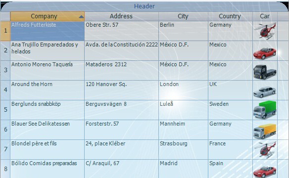
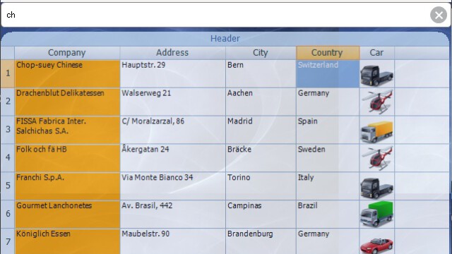
No matter if you prefer a fancy or conservative look Bee Mobile DataGrid has got it all. You can stylize every aspect of its appearance including font style, alignment of objects, margins of cell contents, colors of selection cursor, grid line colors, border colors and many more. DataGrid can have round corners, if you wish. You can also display transparent PNG images within the cells.
User Interaction
Your customers will appreciate the ease of use. Touch scrolling feature is built into Bee Mobile DataGrid. No scroll bars are needed which helps to utilize the small space of on the display of a mobile device even more effectively.
Data manipulation
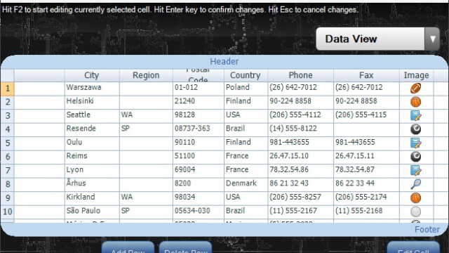
Bee Mobile DataGrid is able to handle different types of data. Not only it can display text and numbers in a traditional way. Boolean values will be displayed using built-in checkboxes. You can also display images.
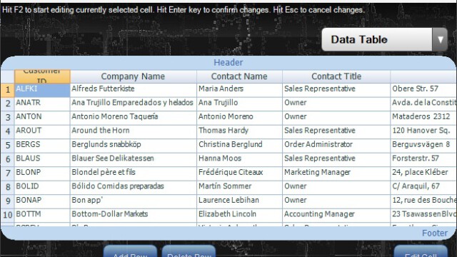
Data binding support will help you to load data into Bee Mobile DataGrid easily and comfortably.
Behavior
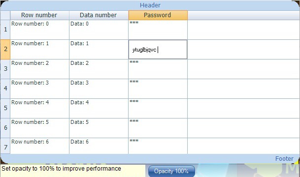
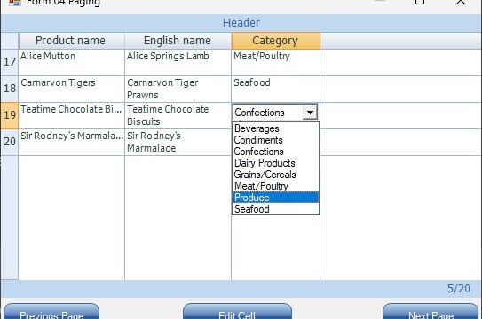
One of the most powerful features when it comes to behavior of Bee Mobile DataGrid is to edit the data cells. For this purpose Bee Mobile DataGrid contains built-in TextBox. You can however supply your own data editing control which will be displayed over a cell when the user starts editing it.
You can select cells individually, or you can switch into a mode when a whole row is selected instead. You can also mark some cells to be unselectable.
Bee Mobile DataGrid also supports sorting by chosen columns. A visual indicator in the form of a small triangle will appear in the columns’s header to inform the user that the data table has been sorted by chosen column.
If you have too much data to display, you can split the output into several pages. Bee Mobile DataGrid contains a mechanism to switch between different pages. This allows you to let the user find the data he is looking for faster and more comfortably.
If you are displaying a report of some kind or just want to display aggregate data, you will certainly appreciate the possibility to display a header and footer.

