KeyboardControl - Usage tutorial
Last modified: April 5, 2012
Chapters
Introduction
KeyboardControl is a .NET Compact Framework control which allows you to create custom keyboard layouts during design-time. Then during run-time you can display the keyboard to the user and change the layouts based on the requirements of the application. In this tutorial we will show you how to create a new keyboard design and then apply it to the keyboard control.
Putting the KeyboardControl on a form
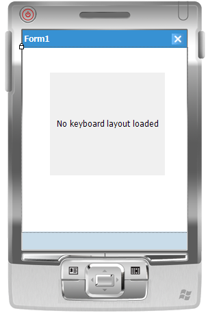
If you installed Bee Mobile iPack to your computer, you should be able to see all the components in the Toolbox of your Visual Studio. Look for KeyboardControl and double-click it in the toolbox to make it appear on your form:

There is no keyboard layout created in the beginning, therefore the KeyboardControl only contains a brief information about this fact. Set the Dock property to Bottom to clamp it to the bottom of the screen. Make sure its Height (part of Size property) is set to 150.
Designing a keyboard layout
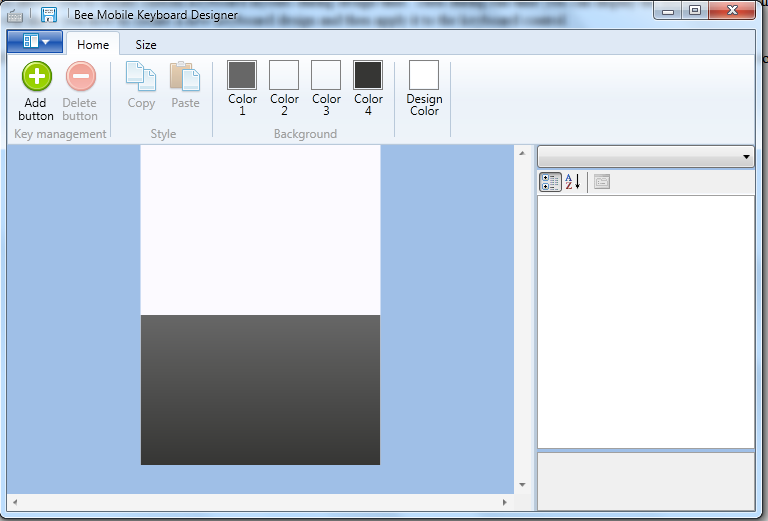
You design keyboard layouts using Keyboard Designer which is an external application shipped together with Bee Mobile iPack. Use Windows Explorer to browse to Bee Mobile iPack installation folder:

The client area of Keyboard Designer application represents the display of your device. The dark gray part represents the area of the future keyboard.
Size of the keyboard layout
First of all you should determine the size of your keyboard. Click the Size menu item from the menu at the top of the designer:

Notice that the height of the keyboard is set to 150 by default. You should design your layout to the same height as the height of the KeyboardControl on your form otherwise it may not fit inside or it may be too small for the KeyboardControl.
There are two pre-defined sizes
- QVGA (designed for displayresolutions of 240×320 pixels)
- VGA (designed for display resolutions of 480×640).
If you would like to have a custom sized keyboard layout (useful mostly for Windows CE developers), check the Custom size check box. You will be able to define the height and width of your keyboard layout in pixels.
If you are creating your application for multiple display resolutions, you will have to create
one design for each display resolution (there is no scaling of a layout performed by KeyboardControl). Windows Mobile developers usually adapt their applications to QVGA and VGA resolutions. If you want to have the same layout for both of these resolutions, you can create a design for QVGA, save it and then click VGA in the ribbon menu. Keyboard Designer will automatically scale your design to VGA resolution. You can save it and you have two layouts for two different resolutions prepared.
Creating the layout
Choose for example QVGA size of your layout and click Home menu item. Now it’s time
to specify the look of the background of the keyboard. The backround of the keyboard can be either:
- filled with solid color
- gradient-filled
- gradient-filled with double gradient
By default the background of the keyboard is gradient-filled. The gradient-fill can only be vertical and starts at the top of the keyboard layout with Color1 which you can see on the ribbon. To change it, simply left-click it and then click the colored rectangle in the Choose color… dialog window which appeared. The gradient-fill ends with Color4 on the ribbon. Set Color1 and Color4 to same colors to get solid-fill. To get double gradient-fill, set Color2 and Color3 to particular colors (by default they are set to transparent).
In this tutorial we will set Color1 to a color with following RGB code: (161,169,179).
Simply left click Color1, then click the colored rectangle from Choose color… dialog window:

and color picker will appear. Type the RGB color codes into it. To the same for Color4, but use this RGB code: (86,98,111). Design Color on the ribbon specifies the color of the background of the designer. By default it is set to pure white.
To add buttons to your keyboard layout click Add button from the ribbon. Your Keyboard Designer should now look like this:

Click and drag the button which has now appeared on your layout. You can move it around with your mouse or use arrow keys on the keyboard to move it with 1 pixel distances. You can drag the edges of the button to resize it. You can also set the size and location of the button using the properties pane on the right side of the designer. To make the button clickable comfortably with a finger make each button at least 22 pixels wide and 30 pixels high. 20×25 is an absolute minimum. Buttons smaller than this would have to be clicked using stylus.
The properties of the button are divided into 3 categories. Following is an explanation for all of them:
| Property name | Explanation |
|---|---|
| Appearance | Category name |
| Background | Specifies the background color of the button. The background can also be solid-filled, gradient-filled or double gradient-filled. The Background property consists of 4 color properties. Same mechanism applies here as for the background of the whole layout. |
| BackgroundPressed | Specifies the background color of the pressed button. Same mechanism applies here as for the background of the whole layout. |
| BorderColor | Color of the border of a button. |
| BorderColorPressed | Color of the border of a pressed button. |
| FontFamily | Font family of letters which appear over the button when the Name property is set. See also Name property. |
| FontSize | Size of the font used for letters which appear over the button when the Name property is set. See also Name property. |
| FontStyle | Style of the font used for letters which appear over the button when the Name property is set. See also Name property. |
| ForeColor | Color of the letters which appear over the button when the Name property is set. See also Name property. |
| ForeColorPressed | Color of the letters which appear over the button when the Name property is set when the button is pressed. See also Name property. |
| Radius | Radius of the border around the button. |
| Common | Name of category. |
| Location | Position of the upper-left corner of the button within the keyboard layout. |
| Name | Name of the button. This text will appear over the surface of the button. |
| Size | Size of the button. |
| Data | Name of a category. |
| CustomText | A string of letters which the keyboard will send to the focused control when the button is pressed. This can be useful for creation of a key which sends letters “www.” to a url text box or sending letters such as “.com” with one button click. Setting this property will automatically clear MappedKey and SpecialKey properties. |
| MappedKey | Specifies a key which should be sent to the focused control when the button is pressed. Setting this property will automatically clear CustomText and SpecialKey properties. |
| SpecialKey | Specifies a special key (such as Ctrl, Alt, PageUp, PageDown, etc.) wihch should be sent to the focused control when this button is pressed. Setting this property will automatically clear MappedKey and CustomText properties. |
| Type | There are three types of button: Button behaves in such a way that immediatelly after it’s been pressed it goes automatically back to the un-pressed state. CheckBox stays pressed until it is clicked again. Modifier stays pressed until any other button is pressed. |
Add buttons to your design and set their properties until you are happy with the created design.
Notice
You can also use the following design which we provide: Click here to download ready-made design of a standard querty keyboard.
When you are happy with your design save it to a bkd (BeeMobile Keyboard Design) file.
Applying the design in Visual Studio Designer
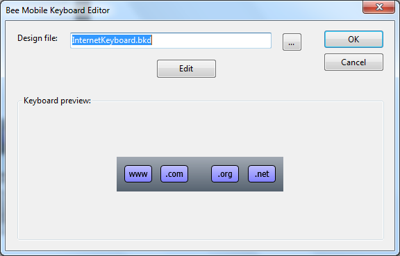
Return back to Visual Studio and click KeyboardControl. Find BKDFile property and click the “…” button next to it. Bee Mobile Keyboard Editor window will appear:

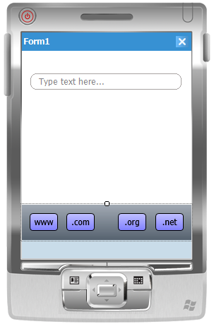
Click the “…” button in the editor and navigate to the BKD file you created with the designer. Once you open that file, a preview of your layout will appear. Click OK to confirm the layout. The layout is now applied to your keyboard. Adjust its height so that the height of the KeyboardControl matches with your design, if necessary. Add another control to the form which accepts text input to test the keyboard (such as Bee Mobile RoundTextBox). The design of your form may now look like this:

This concludes KeyboardControl tutorial. To provide feedback, please write to support@beemobile4.net.


