WaitingBar - Usage tutorial
Last modified: April 10, 2012
To start using WaitingBar for WP7 follow these steps:
- Install Bee Mobile Metropolis to your computer.
- Start Visual Studio 2010 and create a new project of type Windows Phone Application. You will find it in Silverlight for Windows Phone category.
- Browse to the installation folder on your hard drive.
- Read the AddControlsToToolbox.pdf file located in it to find out how to add Metropolis components to Toolbox of your Visual Studio.
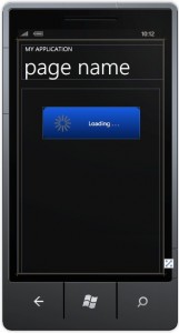
- Double-click WaitingBar from the Toolbox to make it appear on your page:
Explanation of properties
WaitingBar control inherits from System.Windows.Controls.UserControl object; therefore it contains all its methods and properties. Following is a table of properties which we added. They are split into 3 categories: Appearance, Text and Wheel.
| Property Name | Property Description |
|---|---|
| WaitingBar Appearance category | Properties which influence the overall appearance of WaitingBar |
| Fill | Specifies the Linear Gradient Brush parameters used to fill the inside of WaitingBar. |
| RadiusX | Specifies the transverse diameter of ellipse which constitutes the corner of WaitingBar. |
| RadiusY | Specifies the conjugate diameter of ellipse which constitutes the corner of WaitingBar. |
| Stroke | Specifies the color of stroke which outlines WaitingBar. |
| WaitingBar Appearance – Text category | Properties which influence the text written over WaitingBar. |
| Text | Gets or sets the text displayed over WaitingBar. |
| TextColor | Gets or sets the color of text displayed by WaitingBar. |
| TextHorizontalAlignment | Gets or sets the horizontal alignment of text. You can align the text to the center, left or right. |
| TextMargin | |
| TextVerticalAlignment | Gets or sets the vertical alignment of text. You can align the text to the center, top or bottom. |
| WaitingBar Appearance – Wheel | Properties which influence the wheel indicator of WaitingBar. |
| BackgroundVisibility | Should the fill of WaitingBar be visible? |
| WheelBorderColor | Color of the outer line drawn around the wheel indicator. |
| WheelFillColor | Color used to fill the inside of the wheel indicator. |
| WheelHeight | This property specifies the diameter of the wheel indicator. |
| WheelHorizontalAlignment | Aligns the wheel indicator in horizontal direction. You can align the wheel indicator to the left, right or center. |
| WheelIndicator | The color which is used to highlight the wheel indicator. |
| WheelMargin | Specifies the amount of pixels between the edge of WaitingBar and wheel indicator. |
| WheelSpeed | Specifies the delay in milliseconds between each generated frame of the animation. |
| WheelVerticalAlignment | Aligns the wheel indicator in vertical direction. You can align the wheel indicator to the top, bottom or center. |
| WheelWidth | Specifies the thickness of the individual bars which make up the wheel indicator. |
A simple example
In this chapter we will show you how to set-up WaitingBar in a simple particular scenario. Let’s say your application performs background operations every now and then during which you want to display WaitingBar to the user. Because you are creating the application for your company, why not to put a tiny advertising into your app by showing your company’s logo each time WaitingBar appears. We will use this logo in this tutorial:
You can download it from this web site to follow the tutorial or you can use your own.
- Put WaitingBar on your page.
- Set its size to 320×135.
- Set HorizontalAlignment and VerticalAlignment to Center.
- In WaitingBar Appearance category, set RadiusX and RadiusY properties to 40 and set Stroke to Transparent.
- In WaitingBar Appearance – Text category set empty string to Text property.
- In Background Appearance – Wheel category set the following properties according to this table:
WheelBorderColor Transparent WheelFillColor Yellow WheelHeight 22 WheelHorizontalAlignment Left WheelIndicator #FFFFA900 WheelMargin 10,0,5,0 WheelSpeed 100 WheelVerticalAlignment Center WheelWidth 6 - From the toolbox drag and drop Image GUI element on your page and over WaitingBar.
- Set its Source property to your logo image.
- Set Stretch property to None.
- Set HorizontalAlignment and VerticalAlignment to Center.
- Use Margin property to set margins of your Image so that it does not overlap with the wheel indicator. For Bee Mobile logo image we used this value for Margin property: 40,0,0,0
Your page will now look similar to this:
 Set Visibility property for WaitingBar and Image to Collapsed. Put a button on your form. The button will server simply as the source of event which will display WaitingBar. However, in your scenario, that event would likely be the start of a lengthy background operation (data download). Finally we will add two methods to our page – Show() and Hide() which will show and hide WaitingBar whenever they are called.
private void Show()
{
  waitingBar1.Show();
  beeLogo.Visibility = System.Windows.Visibility.Visible;
}

private void Hide()
{
  beeLogo.Visibility = System.Windows.Visibility.Collapsed;
  waitingBar1.Hide();
}

// your button click event handler may look like this:
private void vistaButton1_Click(object sender, RoutedEventArgs e)
{
  if (waitingBar1.Visibility == System.Windows.Visibility.Collapsed)
    Show();
  else
    Hide();
  UpdateText();
}

// the UpdateText method is simple:
private void UpdateText()
{
  if (waitingBar1.Visibility == System.Windows.Visibility.Visible)
    vistaButton1.Text = "Hide";
  else
    vistaButton1.Text = "Show";
}
This concludes the tutorial for WaitingBar control. If you have any questions, ideas, suggestions or recommendations about this tutorial, please write us an email to support@beemobile4.net. Thank you.


